Here is the latest video from my new favourite learning TA channel, they have quite a few on the subject:
About the Chart
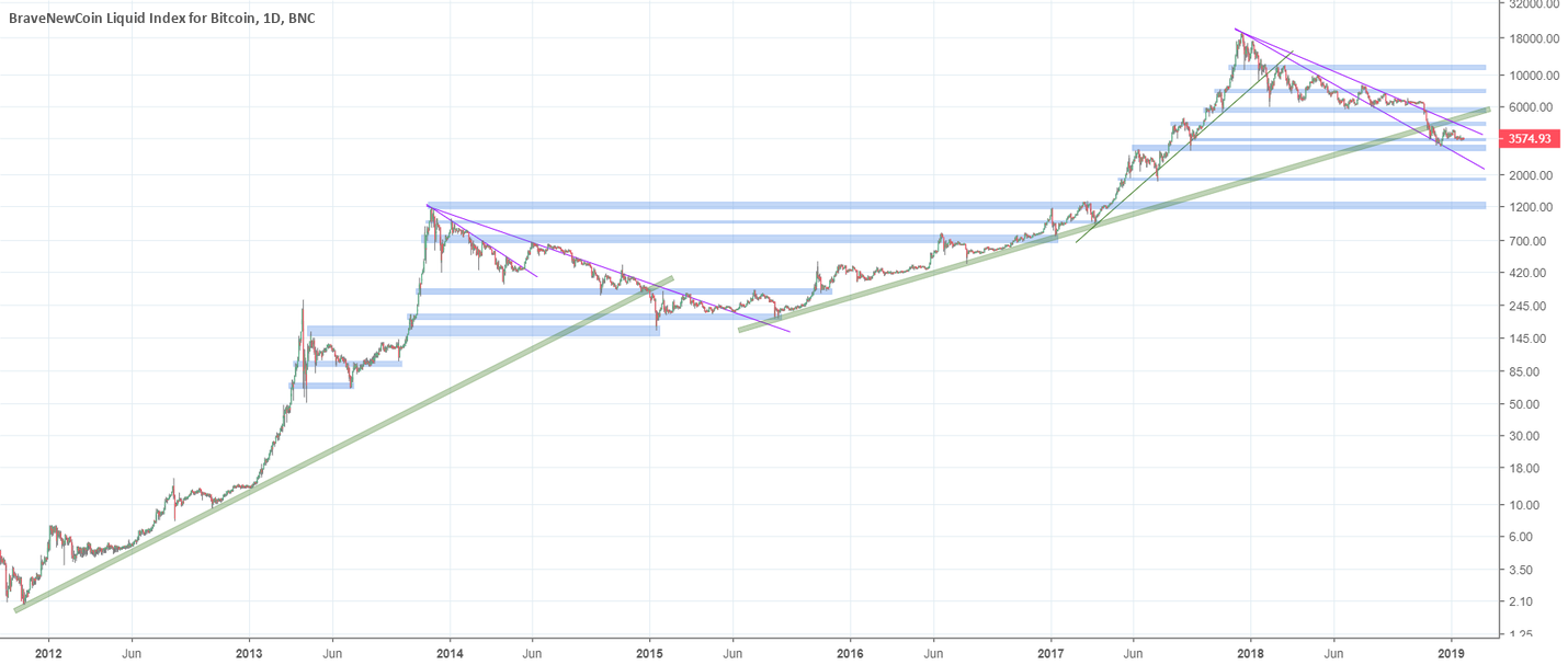
This is the of the last two market cycles, I will post these two cycles separately below in the update section so you can get a closer look at the detail. On the chart I have drawn all the key S & R zones throughout this period. I am sure you all know how zones work and if you don’t, just look up those two words in an English dictionary and you will see the light.
I aim to not give my opinion, but rather hopefully show data in a clear way so that the viewer can draw their own conclusions. So what are your thoughts and opinions? Fire them down below in the comments section…because you don’t have a choice, there is no other place to leave them and of course, inform me of any errors I have made or improvements that can be made to the chart.
Published at Sun, 27 Jan 2019 16:01:46 +0000


