I had various options on how to get data on but I instinctively figured I needed to pull data from an API so that I could frequently update my workings with less hassle. I checked out a few resources online and other people’s work and settled on Quandl. Quandl is a financial data services provider that provides data for free. Voila! Also the company is a credible source because it pulls data from over 60 crypto exchanges/marketplaces and in over 33 currencies. Our analysis will focus on exchange value to the USD. By convention the data from Quandl is structured as BCHARTS/. For this study I opted to look at the following exchanges: LocalBTC, Bitstamp, Kraken, Itbit, and .
If you have ever paid attention to stock exchanges, this table looks strikingly familiar to what you’d see if you were purchasing publicly traded company shares. There’s a daily indicated price for when the marketplace opened , the last price on that particular day, the lowest and highest prices and the weighted price. Our table also shows us the value of the volume of transactions for each day both in and US dollars.
Our analysis data is all available as continuous data and date time series. I decided to first understand what time frames we are working with. The different exchanges offer data from different timelines. For example, Bitstamp has data from 2011 to 2019 while Kraken has data from 2014 to 2019.
I then checked to see our sample statistics across the different exchanges.
Because my goal was to carry out exploratory analysis, I needed to make sure my data is clean and set for visualization. The main thing here for me was to check for any missing values in the different data frames and any anomalies such as outliers.
After checking for missing values, instinctively I would have to check for extremely low and high exchange values given our domain knowledge and reported information. Across the exchanges the lowest recorded exchange price was 0.00 US dollars. However, this lower price was not distributed uniformly across the exchanges if you factor in dates. For example, on Bitstamp 0.00 exchange price was recorded between 30th September 2011 and October 2nd. There were zero traded volumes on that day and that could signal the reason for prices being zero. Optionally, may be there were no records for these dates and the default null value provided by the exchanges is zero.
The next thing, was to look at the maximum values.
We can see from above that something is not right at LocalBTC. LocalBTC reports that its maximum exchange for is 11,232,650 USD. That’s clearly wrong because from context we know peaked at slightly over 19,000 USD. Additionally, as other exchanges hit peak in December 2017, LocalBTC hit its peak 2 months early in October.
We have now identified two problems that may affect our visualization, zero values that can not be explained and a peak price that is significantly unrealistic. This means before visualizing the data, we have to deal with our anomalies that could potentially distort our analysis. I then decided to merge the different data sets using the weighted exchange price but dropped the LocalBTC data set altogether.
We can now take a look at what our graph looks like.
Oops! We still have the zeros and can see how they can distort what is actually going on. For instance, it is unrealistic for ITBIT to report that was at 10,000 USD then slumps to 0.00 USD. Our fix for this is to remove all rows that had a zero.
Next, I got an average of all the weighted price into a new column and used this column to give us a better visual.
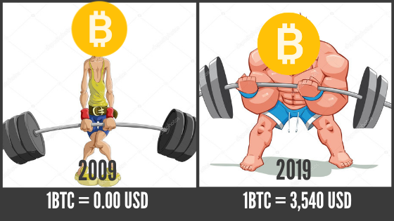
We now have a visual cue of how ’s price has evolved over time. For me, what is important here is not the price but how this price was fueled by demand from people across different countries. The important thing here is that the price is not too far removed from the people who actually are willing and able to pay for it. Traditionally, valuations are about what investors think people will be willing to pay for earnings in the future. But has no earnings, so what gives? The earnings for is the itself. And it gets harder and harder to mine. It’s a scarcity market driven by digital natives who function on fear of missing out (FOMO). Conventional or traditional does not work here.
Published at Mon, 04 Mar 2019 22:04:30 +0000


